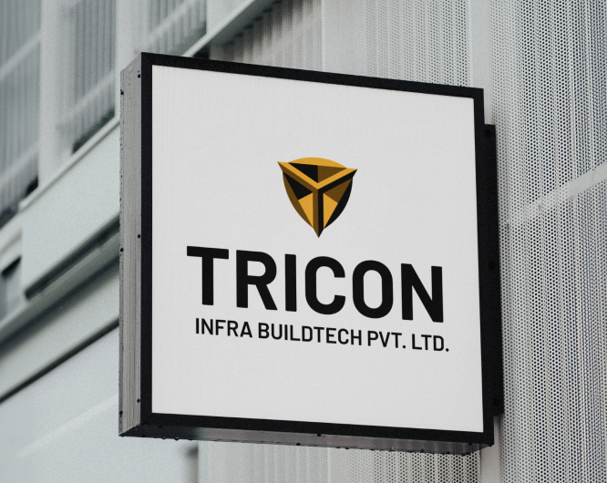
Tricon Infra Buildtech aimed to refresh its brand identity to reflect its growth and commitment to quality, safety, and innovation in the construction industry.
Strategy
We created a bold and professional brand identity, incorporating the letter “T” in a 3D style to symbolize strength and the foundation of buildings, reinforcing Tricon’s role in constructing solid and reliable structures. The color scheme of yellow, gray, and black.
Result
The rebrand positioned Tricon as a modern, trusted leader in the construction industry, enhancing their market presence and engagement. The new website improved user interaction and effectively communicated Tricon’s expertise, leading to increased client inquiries.
Results
We, walk the pathway to interact with our clients, other businesses along the supply chain and customers for complete clarity on the positives and ambiguities of the brand has. We, walk the pathway to interact with our clients, other businesses along the supply chain and customers for complete clarity.
Earth Culture sought to establish a premium brand in the DIY gardening space, offering high-quality seeds, planting materials, and ornamental plants for home décor and green gifting.