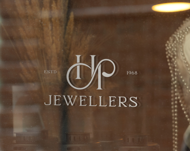
HP Jeweler’s, a brand with over 50 years of heritage, aimed to refresh its identity and enhance its brand image while expanding its presence in the city.
Strategy
We led a comprehensive rebranding, designing a logo centered around the infinity symbol intersecting with “H” and “P,” representing the brand’s lifelong bond with its customers. This symbol reinforced the idea of eternal relationships, trust, and elegance. Tailored messaging addressed the customer’s need.
Result
The rebrand revitalized HP Jewellers’ image, attracting new and loyal customers alike. Increased foot traffic, heightened brand recognition, and a rise in sales solidified HP Jewellers’ standing as a go-to destination for quality and timeless jewelry.
Results
We, walk the pathway to interact with our clients, other businesses along the supply chain and customers for complete clarity on the positives and ambiguities of the brand has. We, walk the pathway to interact with our clients, other businesses along the supply chain and customers for complete clarity.
Genericplus aimed to strengthen its brand presence and credibility as India’s leading generic medicine chain, while expanding its pharmacy franchises and improving customer engagement.