Common Roots Extracts wanted to establish themselves as a trusted brand in the cannabis extraction industry. They sought a brand identity that reflected their commitment to quality, craftsmanship, and their unique location in Canada, while also appealing to both consumers and partners in the industry.
Strategy
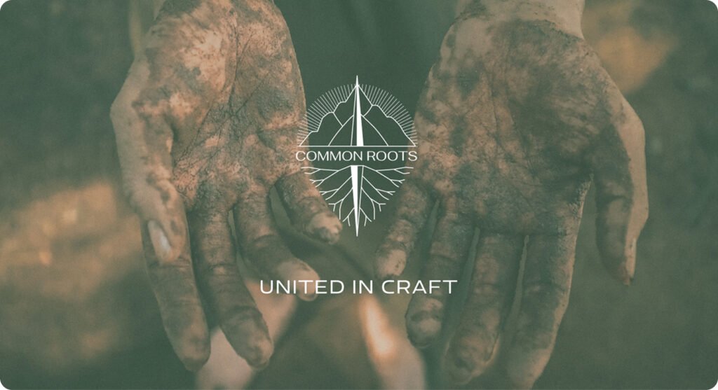
We developed a brand identity that embodies the unique geographic and natural origins of Common Roots Extracts. The logo design integrates symbols of mountains and roots, paired with a compass needle and location pin, reflecting both their deep connection to the land and their precision in the extraction process. The tagline “United in Craft” was developed to communicate their dedication to quality and craftsmanship. The brand collaterals were designed with green and brown tones to evoke nature and trust, paired with a professional yet passionate typeface. We also developed a website to showcase their services and commitment to innovation.
Result
The new brand identity resonated with the audience, successfully positioning Common Roots Extracts as a leader in the cannabis industry. The brand’s presence at trade shows led to valuable leads and business inquiries, further strengthening its market position.