Tricon Infra Buildtech aimed to refresh its brand identity to reflect its growth and commitment to quality, safety, and innovation in the construction industry.
Strategy
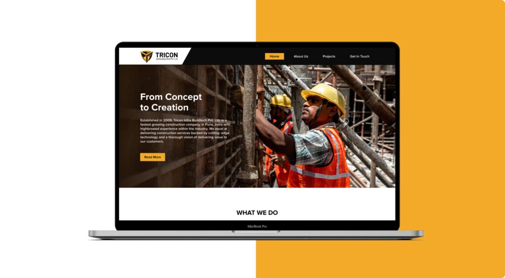
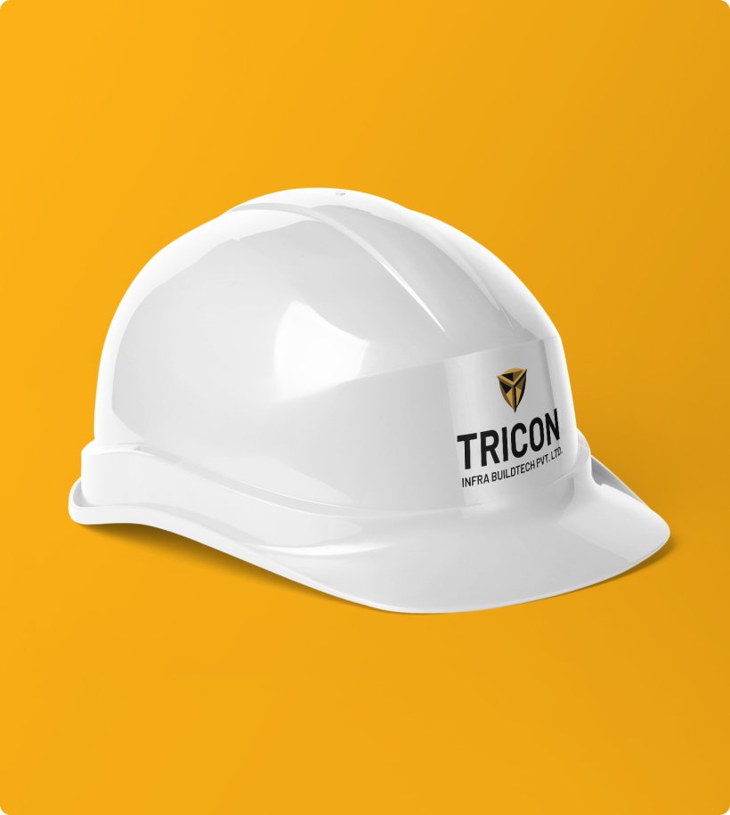
We designed a bold 3D “T” logo for Tricon, symbolizing strength and reliability, with a safety-focused color palette. A user-friendly website and dynamic video showcased their capabilities
Result
The rebrand positioned Tricon as a modern, trusted leader in the construction industry, enhancing their market presence and engagement. The new website improved user interaction and effectively communicated Tricon’s expertise, leading to increased client inquiries